
That’s right. Refreshing your brand doesn’t mean you’ll lose what made your company. In fact, just the opposite should be true.
Take case in point, our client Backcountry Provisions. The two adventure loving, yet seriously dedicated founders came to us saying “we need to do a better job telling people our story”, but “we don’t want to lose our soul”. They meant it.
This, in essence is their company’s soul: A true deli experience — no-nonsense, no fillers, no shortcuts, fresh daily, exceptionally prepared, always natural, nutritious, great tasting food that fuels active, bold lifestyles.
Here’s what we did, starting with the name. We learned Backcountry Provisions was tripping many people up – making them think it was a place to buy provisions like backpacks, or was even a travel agency. This had to change. We loved that Backcountry symbolized active, bold lifestyles. Provisions was the culprit. It did not symbolize natural, nutritious, great tasting food by any stretch of the imagination. The solution. Backcountry Delicatessen. Of course this was not genius. It was right in front of our face.
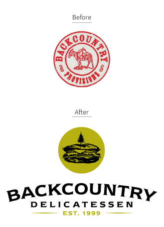
This also meant the existing logo – the poor pack mule had to go. What was needed was an identity that represented both “backcountry” and “delicatessen”. Through the creative process we arrived at a playful identity that combines the two concepts through an illustration of a sandwich with its ubiquitous swizzle toothpick actually being a pine tree. The woodcut style also supported the authentic, welcoming feel we wanted the new brand to follow.
Then came a simple slogan, or mantra if you will, to personify the Backcountry’s driving philosophy –“ Eat well. Be bold.” We even added a little support messaging called the Backcountry Creed. Nothing silly. Just a few soulful words.
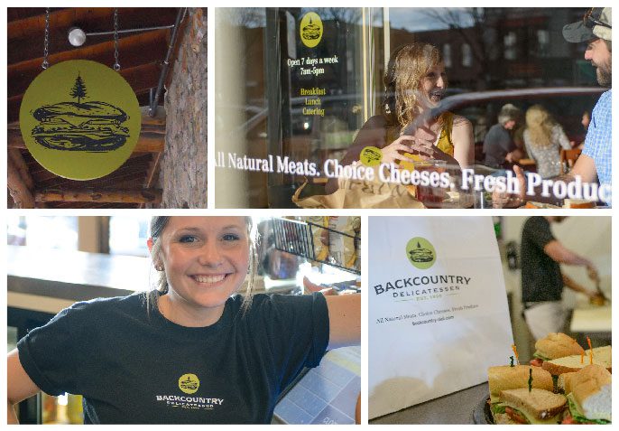
As we began to work on packaging, exterior signage, interior refreshes and brand touch points, the word “soul” continued to guide us further. It was kinda like that old pack mule knew where to take us next. Where it guided us was away from anything that said franchise. No typical tacky signs or sayings, or images of sandwiches plastered everywhere. In fact, in the end, you’ll be hard pressed to find even the slogan or messaging anywhere in the actual delis themselves (hint: look at the back of the takeout menu).
Through the development of the new name, identity, signage, website, launch campaign, social media profiles, and interior design guidelines, I believe One Tribe succeeded in keeping the “soul” in Backcountry Delicatessen. And in so doing, the Backcountry story is better appreciated and winning new customers everyday.